
This page is the visual reference for documentation authors. Use the simplest block that makes the information easier to understand.
Typography
A clear section heading
Body copy should be concise and direct. Use bold text for important terms, inline code for values and controls, and links when the reader needs another page.
Blockquotes are best for a short principle or a direct quotation. They should not replace callouts.
Callouts
Buttons
Use buttons for a clear action. Keep one primary action per group; links inside prose should remain normal text links.
Cards
Cards work well for a small set of related destinations. Avoid using them as decoration around ordinary paragraphs.
Steps
Choose an app
Open the app that matches the task you want to complete.
Configure the result
Select a model, add your prompt, and review the available controls.
Generate and review
Start the job, then inspect the result in your Gallery.
Tabs
Use tabs when the same instruction has a small number of mutually exclusive variants.
Accordions
Use accordions for optional detail. Important instructions should remain visible on the page.
When should I use an accordion?
Use one for troubleshooting detail, definitions, or secondary explanations that only some readers need.
What should stay expanded?
Required steps, safety information, and the main answer should always stay visible.
Code
Use inline code for short values. Use a fenced block for commands or examples that readers may copy.
npm run dev:marketingconst result = await generate({
model: 'gemini-image',
prompt: 'A clean product photograph',
});Tables
Tables are best for compact comparisons and exact mappings.
| Block | Best for | Avoid when |
|---|---|---|
| Callout | Context, risk, or tips | The content is ordinary prose |
| Card | A small group of destinations | There is only one link |
| Tabs | Parallel variants | Readers need to compare variants |
| Accordion | Optional detail | The information is required |
Images
Use images to show product state or clarify a visual control. Crop tightly, keep labels readable, and add descriptive alt text.
Video and embeds
Use a 16:9 embed for short product walkthroughs. Introduce the video in text and summarize the important outcome below it so the documentation remains useful without playback.
The Embed component accepts a src and title for hosted videos or interactive demos:
<Embed
  src="https://www.youtube-nocookie.com/embed/VIDEO_ID"
  title="Create your first generation"
  allowFullScreen
/>
Screenshots vs interactive demos
Use both. They solve different problems.
| Prefer | When |
|---|---|
Screenshot (ImageZoom) |
Full UI context: layout, navigation, multi-panel flows, “where do I click?” |
Interactive demo (SnippetCard, GalleryCard, CardStack) |
A single control or card pattern the reader should recognize and try (hover, status, copy) |
| Neither | A pure concept that prose, a table, or steps already explain clearly |
Rules of thumb:
- Do not rebuild whole pages as live UI. Demos go stale and pull readers out of the guide.
- One interactive demo per section is usually enough.
- Always introduce the demo in text: what it is, what to try, and what it means in the product.
- Prefer real product imagery under
marketing/public/docs/images/when the card needs a photo.
Wrap demos in <AppDemo> so the documentation prose styles do not restyle the card chrome. Use <AppDemoGrid> for side-by-side cards.
Interactive app elements
These are presentational ports of app card shells (same tokens, borders, badges, and hover affordances). They are not the live app components — they use mock props and local interaction only.
Prompt snippets
Hover to expand the category badge. Click the card or the copy button to copy a mock @token.

Leica 80mm
Shot with the optical character of a Leica 80mm medium-telephoto lens, featuring natural perspective compression.
Neon Cyberpunk Aesthetic
A color palette of vibrant magenta, deep black, neon green, and cyan glow.
Hover the card, then copy the token.
<AppDemo caption="Hover the card, then copy the token.">
  <AppDemoGrid>
    <SnippetCard
      title="Leica 80mm"
      description="Shot with the optical character of a Leica 80mm..."
      category="camera"
      image="/docs/images/demo-bridge.jpg"
      version={3}
    />
  </AppDemoGrid>
</AppDemo>
Gallery cards
Single assets use a full cover image, mode badge, optional media-info pill, and a 7px status bar. Hover reveals the real status + favorite control plate (same chrome as Gallery).

Hover to open status / favorite. Resting favorite shows only the star; status stays on the bar.
<AppDemo>
  <GalleryCard
    type="IMAGE"
    image="/docs/images/demo-red-panda.jpg"
    infoPill="4K"
    status="good"
    starred
  />
</AppDemo>
Closed stack cards
Similarity stacks keep a colored pile under the card (--pile-rest = status color or grey; hover swaps to mode color), a collage grid of stack previews, a stack count badge, and the same status bar / hover controls. No expand interaction in docs — the closed look is the point.
Hover the pile: layers shift to the mode color. Status bar tints the pile at rest.
<AppDemo>
  <CardStack
    type="IMAGE"
    images={[
      "/docs/images/demo-red-panda.jpg",
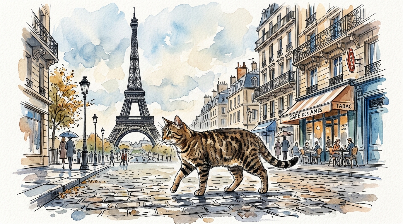
      "/docs/images/demo-paris-cat.jpg",
      "/docs/images/demo-bridge.jpg"
    ]}
    stackCount={6}
    status="good"
  />
</AppDemo>
Opened stack (static)
Use <StackOpenDemo> to show an expanded stack inside a gallery, not as an isolated row.
A fake 3×2 grid: cards 2–5 are the open stack (full brightness, no status — stacks group by status), cards 1 and 6 are the rest of the gallery at ~15% opacity so the stack stands out.
Open stack in context: neighbors dim; stack members stay clear and share no status.
<AppDemo>
  <StackOpenDemo
    type="IMAGE"
    images={[
      "/docs/images/demo-red-panda.jpg",
      "/docs/images/demo-paris-cat.jpg",
      "/docs/images/demo-bridge.jpg",
      "/docs/images/demo-red-panda.jpg"
    ]}
  />
</AppDemo>